Background

I led the revamp of SHOPLINE’s decade-old checkout experience—an e-commerce SaaS platform handling over USD 750M annually in Greater China. Collaborated closely with product and engineering teams to redesign the entire journey from cart to order completion, informed by 46 rounds of user research and testing in Taiwan and Hong Kong.

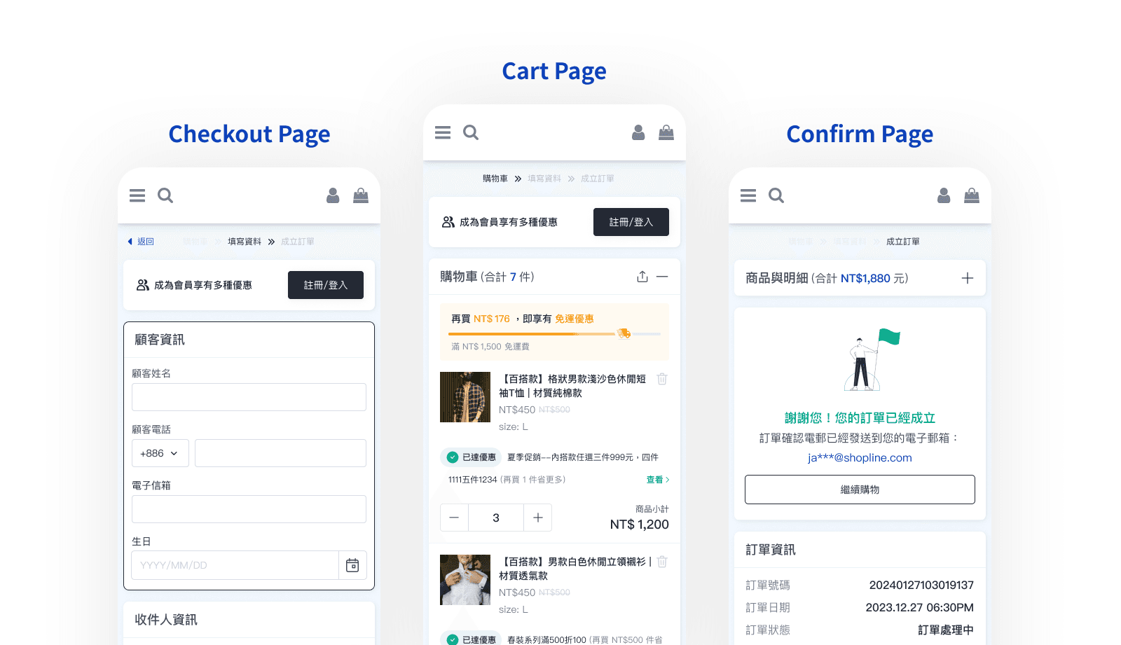
As SHOPLINE is a multi-industry e-commerce platform, the redesign focused on ensuring flexibility and scalability. The scope included the Cart, Checkout, and Confirmation pages, all optimized for responsive layouts (RWD)

Overall Workflow

Goals & Design Strategy

01 Improve Normal and Multi-Checkout by addressing pain points.
02 Simplify information and boost checkout efficiency.
03 Make checkout process compatible with other channels.
04 Cut API response time by 20%, enhance front-end maintainability, and increase checkout page customization.
05 Add consumer-side data tracking for quantitative-qualitative insights to guide iterations.
06 Post-launch, phase out legacy checkout within one year, with no new features added.

Problem Statement

01 Frustrating User Journey & Outdated UI: The existing checkout experience for Normal Checkout has complex information , pain points, and outdated UI style.
02 Restricted Multi-Cart Functionality & Low Usability: The current multi-cart functionality, limited by the existing consumer-side structure, has usability issues.
03 Incompatibility Across Application Touchpoints: The current version cannot be used by other application endpoints (e.g., Shopper App).

Trigger: Scoping Checkout Revamp Initiative

Trigger: Scoping Checkout Revamp Initiative

Trigger: Scoping Checkout Revamp Initiative

With stakeholders, align on the scope from product exploration to purchase confirmation

With stakeholders, align on the scope from product exploration to purchase confirmation

With stakeholders, align on the scope from product exploration to purchase confirmation

Qualitative Action Plan

Heuristic Evaluation

5 sessions (drove cross-team alignment on redesign strategy)

Revamp Testing

10 sessions (conduct A/B Testing and Proposal Usability Testing)

Mobile Usability Testing

9 sessions (with 76% of checkouts on mobile devices)
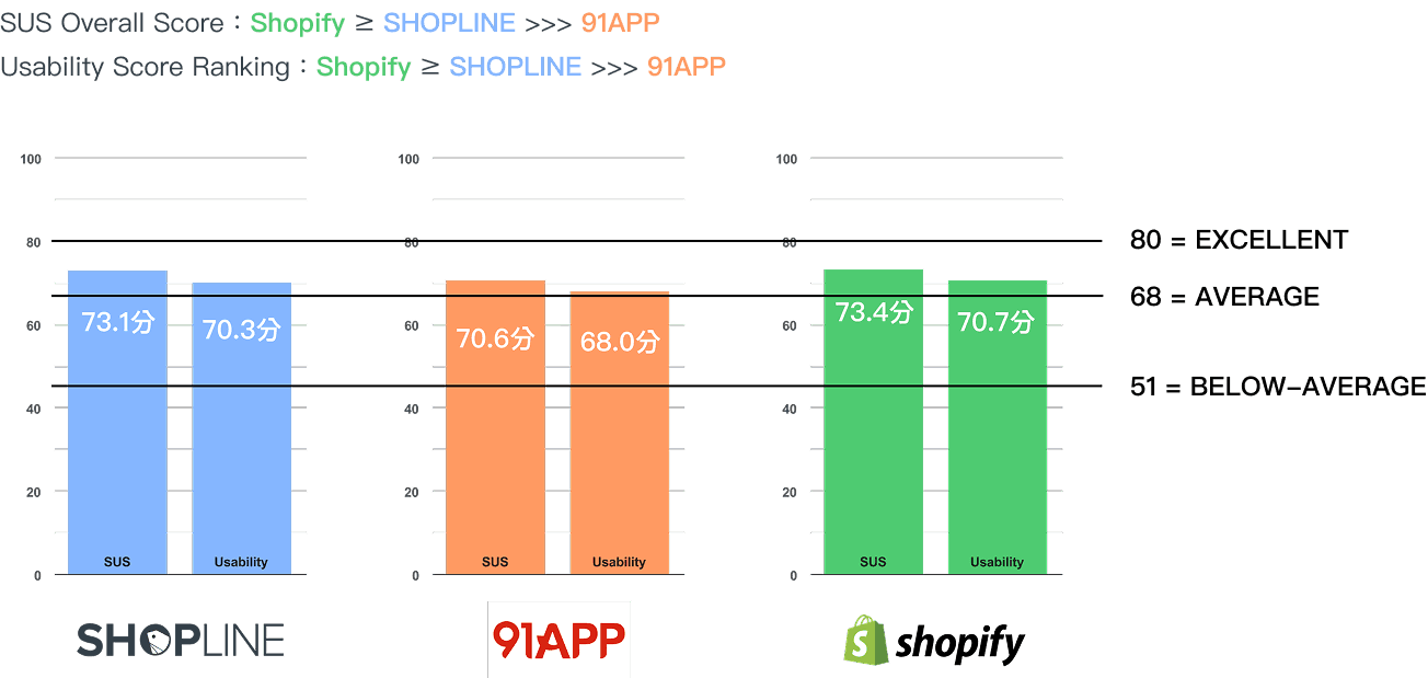
Competitive Testing

9 sessions (compared new version with Shopify and 91 App )

Promotion Procedure Testing

18 sessions

Quantitative Analysis

Goal Metrics

01 Order Completion Rate

02 Average Order Value (AOV)

Driver Metrics

01 From "Add to Cart" to "Info Page"

02 From "Info Page" to "Confirm Page"

Behavior Insights

01 Checkout Time

02 Conversion Rates

03 Clicks on promotion thresholds

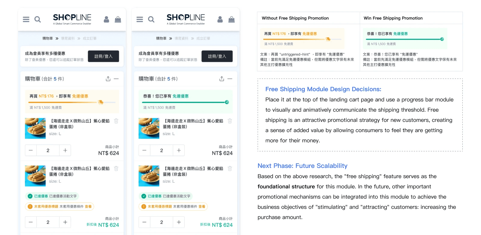
04 Free Shipping Modules

05 Coupon or Promo Code Modules

"Due to business confidentiality, only visual representations of the data are shown."

"Informed by insights from both qualitative research and quantitative data, I identified usability and trust issues in the existing checkout flow and UI System. To address them, I developed a new design system grounded in atomic principles and neutral aesthetics. With a mobile-first revamp of the checkout experience, we ensured consistency across devices and streamlined both Normal and Multi-Checkout experience."

01: Build New Design System

01: Build New Design System

01: Build New Design System

"This is a preview of the Design System. For the complete version, please refer to the link."

View Design System

02: Creating a Grid-Based Responsive Layout

02: Creating a Grid-Based Responsive Layout

02: Creating a Grid-Based Responsive Layout

A mobile-first approach using custom breakpoints and grid systems to ensure consistency across devices

A mobile-first approach using custom breakpoints and grid systems to ensure consistency across devices

A mobile-first approach using custom breakpoints and grid systems to ensure consistency across devices

How We designed the Desktop Layout?

How We designed the Desktop Layout?

How We designed the Desktop Layout?

Two proposals to navigate user habits and drive usability improvements

Two proposals to navigate user habits and drive usability improvements

Two proposals to navigate user habits and drive usability improvements

Collapsible Module: Designed for Mobile and Tablet

With 80% of users on mobile, the collapsible module simplifies navigation and enhances content accessibility on phones and tablets.

03: The Visibility of Free Shipping Module

03: The Visibility of Free Shipping Module

03: The Visibility of Free Shipping Module

By prominently displaying free shipping offers, it boosts visibility and drives order completion

By prominently displaying free shipping offers, it boosts visibility and drives order completion

By prominently displaying free shipping offers, it boosts visibility and drives order completion

Checkout Page: Structured Form Fields

A unified design system aligned inconsistent components and grouped required vs. optional fields, streamlining form completion and reducing checkout time.

Payment : Method Visibility

To support business goals and enhance clarity, labels and promos were used to surface all available payment options, empowering users to choose their preferred method.

Final Evaluation: Competitor Usability Testing

Final Evaluation: Competitor Usability Testing

Final Evaluation: Competitor Usability Testing

I believe that all design comes from

real-life. Let's create exceptional products together!